Better and better keyboards
(This post originally appeared on Jesse’s blog in December of 2013.)
It’s been a while since I’ve written about my keyboard-building adventures….apparently, I haven’t blogged about keyboards since April of this year. I’ve been too busy designing keyboards.
The first thing I should get out of the way is that you’re going to be able to buy one. We’re working hard to finalize a design and find manufacturing partners. If you want to know when we’re ready to take your money, head on over to http://keyboard.io and sign up for our announcement list.
When I last wrote about keyboards here, I’d just completed my first fully homebrew design - the Mark 2 keyboard. From my phrasing, it was pretty clear that I intended to tell you about the Mark 3 that I’d already built.
Mark 3 Keyboard
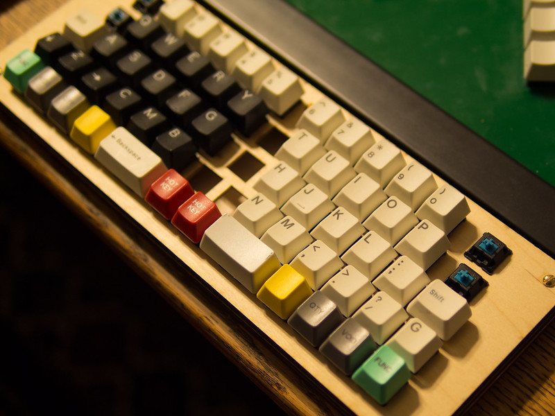
The Mark 3 was an attempt to build the most compact, yet reasonably ergonomic keyboard I could. It was also the first time I got to drive the lasercutter myself. As such, the folks at Danger!Awesome had me use plywood rather than acrylic.
The keys were arranged in what’s known as a ‘symmetric stagger’ It was quite compact. And I didn’t like it at all. Among other things, the thumb keys just weren’t as comfortable as I wanted.
Mark 4 Keyboard
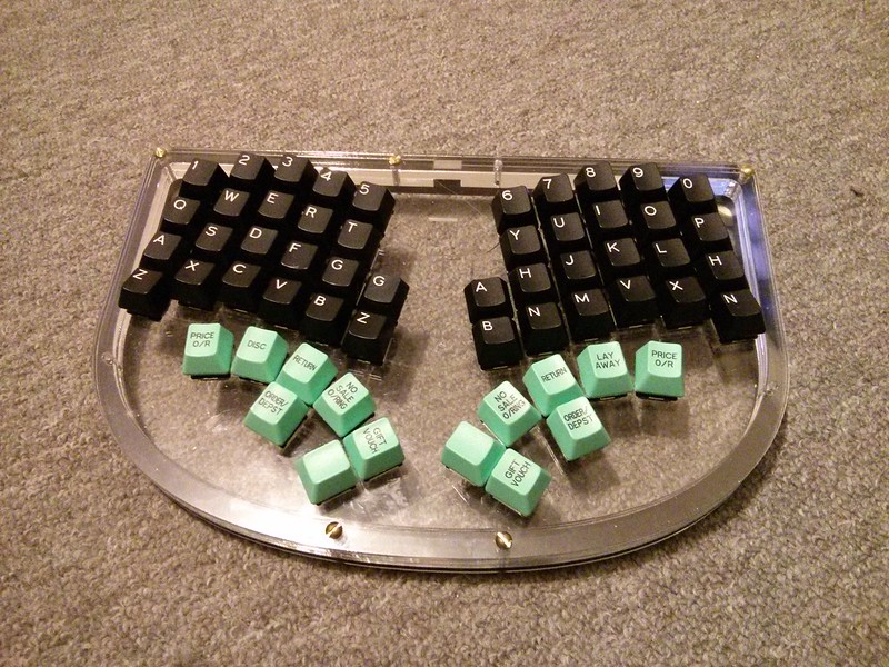
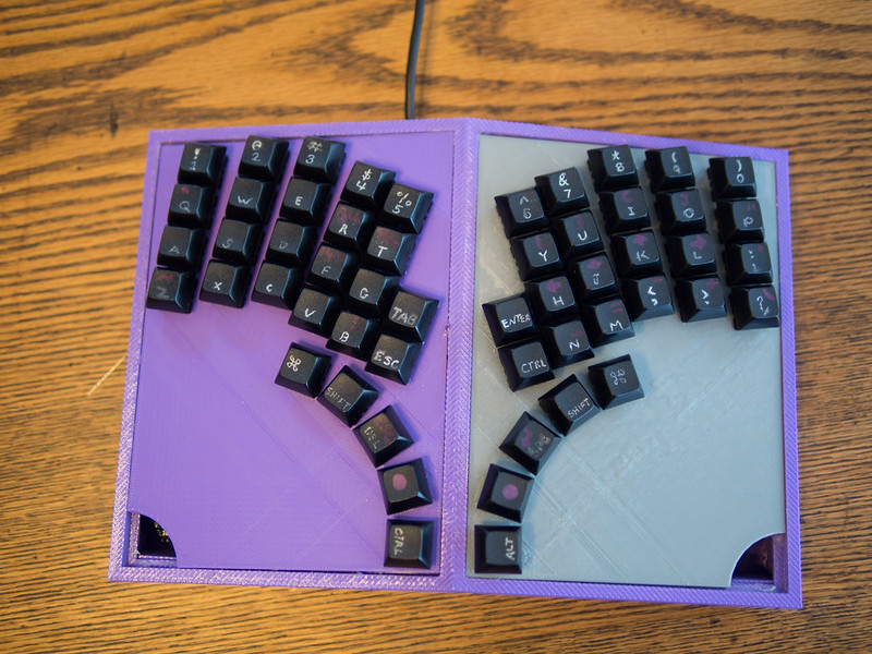
The Mark 4 was the first thing that started to feel right. It was also my first foray into TRON-style thumb keys. I loved them. And hated them. I got the angles and positioning wrong. And my brilliant idea of having two rows per-thumb was a total bust. They just made it harder to hit either row. But it looked cool. Man did it look cool.
Mark 5 Keyboard
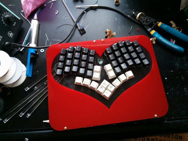
The Mark 5, I finished just in time for Valentine’s Day. A friend remarked that it looked kind of like a heart. So I made it look a lot like a heart. It was actually pretty good, but had a couple fatal flaws.
I was late for my lasercutting appointment when I decided to place the heart…and I misaligned it. I ended up having to dremel notches into a couple of the number-row keys in order to get everything to fit. The thumb keys with a shared central diamond seemed like a great idea when I was designing it, but in practice it was a pain to use. It was really hard to hit the top key in the diamond. For the keymap I was using at the time, that was the Control key. Emacs-using friends absolutely hated it. I got enough time typing on the Mark 5 that I finally started getting comfortable…except that I found my pinkies just sort of hanging out over the edges of the keyboard much of the time. It took a little while, but at Kaia’s urging, I added an extra column for each pinkie on later models. This dramatically improved the usability and comfort for me.
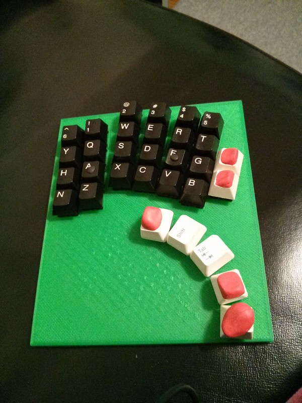
This was right around when my 3D printer finally showed up. I spent most of a month teaching myself the rudiments of 3D modeling with OpenSCAD. It took a lot of tweaking to be able to reliably generate keyboard 'plates’ that would reliably seat keyswitches without being so tight they caused the switches to bind or so loose the switches popped out.
Mark 6 Keyboard
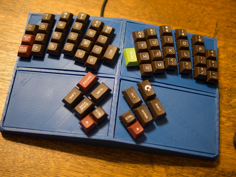
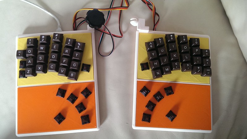
The interesting things about the Mark 6 were:
- It was 3D printed. Each of the 'hand’ plates took 3-4 hours to print. The bottom shell took about 12.
- The key columns were splayed to better line up with where your fingers end up when you reach
- It was tented – The middle of the keyboard was just slightly taller than either side.
- It had a rather significant negative slope – the part of the keyboard under your wrists was higher than the part further away from you.
- The keyplates were separate from the shell of the keyboard. This made it really easy to iterate on key layout separately from keyboard shape.
The things that sucked about the Mark 6 were:
- The column splaying was far too wide. I could reach everything, but it wasn’t particularly comfortable.
- The negative slope was far too pronounced. It was just uncomfortable to use with the bottom of the keyboard flat on the desk.
- I still hadn’t added the extra columns Kaia had suggested.
Mark 7 Keyboard
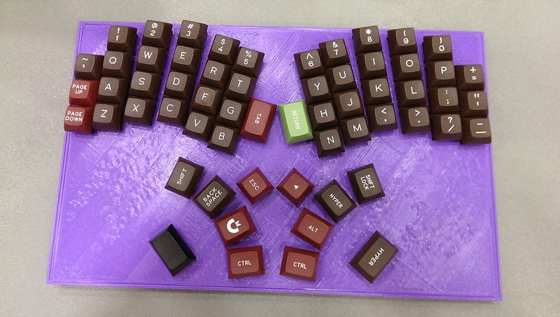
The Mark 7 was a fairly straight forward iteration from the Mark 6. Neat things about the Mark 7 included:
- Splitting the thumb and finger keys onto two different plates. This let me slightly change the angle between them.
- Switching from a 5 key arc of thumb keys to a four key arc with a key above the arc and a new 'palm’ key. The palm key, in particular, turned out to be pretty amazing. I use it to enable an additional layer of keys. Arrow keys live under HJKL. {}[] live under YUIO, and so on.
- Slightly reducing inter-column finger splaying.
- Finally adding the extra columns of pinky keys. These meant that the ` = ’ - keys no longer needed to be hidden away on the second layer.
What didn’t work so well in the Mark 7:
- The keyboard shape was still pretty boxy
- The inter-column finger splay was still too wide
- The thumb keys were a bit too far away from the rest of the keyboard.
Mark 8 Keyboard
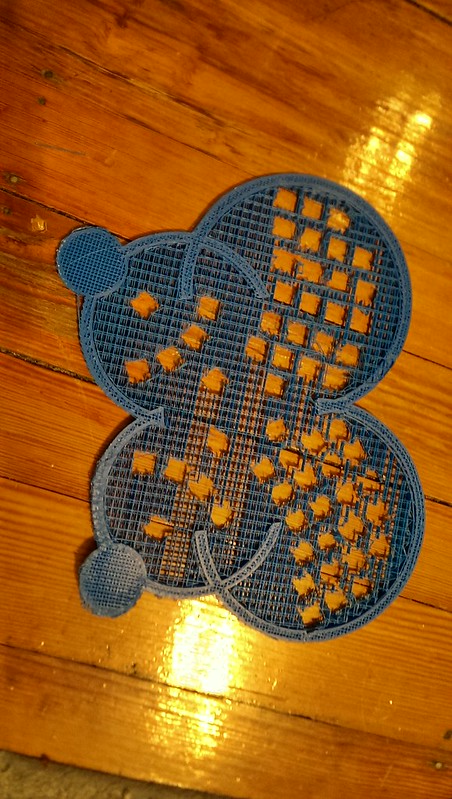
The Mark 8 was my first attempt to make a thin keyboard. It was identical to the Mark 7, except it was printed as two pieces – a single key plate and a single bottom shell.
The biggest issues with the Mark 8 were that its shell wasn’t structurally sound and that the front edge of the keyboard was sharp and ended up right in the middle of the user’s palms.
Mark 9 Keyboard
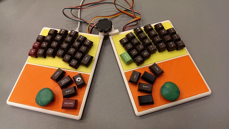
I spent a full week teaching myself how to design and 3D-print ball joints for the Mark 9. Two of those days were spent figuring out how to print all the parts of a ball joint as a fully assembled unit. Once I had it pretty well worked out, I realized that I was actually better off printing the two halves separately.
Mark 9 Keyboard, in two pieces
Things that were really cool about the Mark 9:
- It had a ball joint!
- You could position the two halves independently!
- It was thin!
- It had rounded corners and edges!
- It was the first keyboard I managed to print in ABS rather than PLA. As such, it just felt a lot nicer. Also, the colors were more exciting. (If pushed, I’ll admit that the color choices were dictated by when I ran out of each spool of filament.)
- I slightly reduced the inter-column finger splay. It was starting to feel reasonable.
Things that could have been better about the Mark 9:
- It was basically impossible to use in my lap or tented on a desk – The balljoint didn’t work well enough to use unless the keyboard was on a flat surface.
- The cables I used between the two halves were too brittle and unwieldy.
- It suffered from the same problem as every other 3D-printed keyboard I’d made to date - When I showed it to someone, they got really excited about the fact that I had a 3D printer. In contrast, whenever I showed someone one of the layered acrylic prototype keyboards I’d built, they got excited about the keyboard.
Mark 10 Keyboard
The Mark 10. I don’t have a lot to say about the Mark 10.
Things that sucked about the Mark 10:
- While trying to print it, my 3D printer caught on fire.
Things that were great about the Mark 10:
- I was forced to switch back to layering sheets of lasercut acrylic. While frustrating at the time, it was ultimately really, really good.
Mark 11 Keyboard
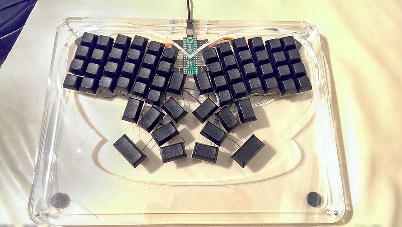
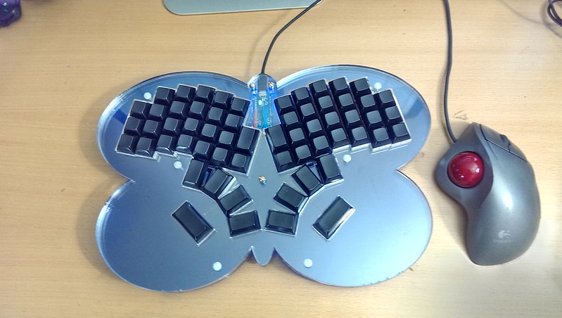
I built the Mark 11 to take to XOXO. I’d had a lot of time to think and play since I’d made the Mark 9. And the Mark 9 just wasn’t a usable keyboard for me. I procrastinated just a little bit too much and didn’t have enough time to lasercut it myself. I ended up paying the nice folks at Danger Awesome a rush fee to get it cut within 24 hours after I emailed them my EPS files. Like the earlier lasercut keyboards, it was made out of stacked layers of acrylic. I went back to the completely-clear acrylic I’d used in the Mark 3, except this time I made the topmost plate thicker to better protect the key edges as I slid it in and out of my bag and to slightly raise the typist’s hands into a more neutral position. The heart shape didn’t work well with the palm keys – playing around a little bit, I cut out a medium arc around the palm keys. It looked a little bit like a butterfly.
In general, I really liked the Mark 11. It was the design in a while that I was actually able to use as my primary keyboard. People I showed it to also liked it. This made me pretty happy. The comment that most blew me away was “If you made a commercial keyboard just like this, you could sell it in the MoMA Shop.”
There were a few things about the Mark 11 that didn’t work:
- It was really heavy. Really, really heavy. It turns out that a 9"x13" sheet of ½" thick acrylic is heavy. Who knew?
- The sheet of acrylic that served as the keyplate started cracking pretty quickly. I’d seen that a little bit on earlier designs, but for whatever reason, the the Mark 11 was doing a pretty good imitation of a spiderweb.
- The top layer of acrylic (the one in the butterfly shape) did a really good job of putting not one, but two sharp edges under each palm. On top of that, the positions I’d chosen for the screws that held the keyboard together put screws in a perfect place to bite into your palms.
Mark 12 Keyboard
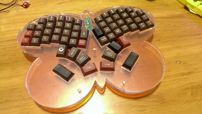
In an effort to cut down size and weight, the Mark 12 changed up the design just a little bit. I made the butterfly shape, now quite intentional, the outer edge of the keyboard. I did my best to keep the footprint the same size as an 11" MacBook Air. To help cut down on weight, I made the bottom layer of the keyboard a bit thinner. To better support the keyplate layer (and cut down on cracking), I made the electronics-wiring layer of the keyboard a full sheet with specific cutouts, rather than a wide outline. To further cut down on cracking, I changed most of the right angle cuts on the keyplate to gently rounded corners. (They may be somewhat out of vogue for web design, but rounded corners are really useful for lasercutting.) I moved the screws so they wouldn’t bite into a typist’s palms. To give it just a little bit more personality (and to make interlayer dust slightly less obvious, I cut the electronics-wiring layer out of translucent orange acrylic. After assembled, I softened the sharp edge under the typist’s palms with a hand file. The layout didn’t change much from the Mark 11. Just about the only thing I did was to tighten the inter-column finger splay just a bit more. Based on a study at Berkeley that claims any key spacing of 17mm or more doesn’t increase error rate or typing pain for large-handed users, I tightened the baseline inter-key spacing to exactly 18mm. (I’d have tried 17mm, but knew that my current keycaps were just too big.)
The Mark 12 was good. Really good. I liked it. It felt nice to type on. It was fairly compact. It was totally manufacturable. The only real issues I had with it were that the palmrests were about half an inch too small for my hands and I’d misguessed on the lower bound of key spacing I could get away with – they would sometimes scrape against each other as I pressed them.
Mark 13 Keyboard
I’m typing this on the Mark 13 keyboard. I feel more comfortable on it than on any other keyboard at this point. While I’d like the Keyboard.io Model 01 to have 17mm or 18mm key spacing, I bumped the spacing on the Mark 13 up to 18.5mm to improve the typing experience with the commodity keycaps I have access to. The Mark 13 also improved the palm rest shape and played around a little bit with the butterfly shape to make it slightly prettier. The biggest change in the Mark 13 is inside. I’m still using the same solder and wire-wrap technique I’ve been using for most of the past year, but the Mark 13 is the first keyboard powered by an Arduino Micro rather than a Teensy.
The Teensy is a fantastic prototyping platform. And there are several very, very nice opensource keyboard drivers available for it. As I’ve been starting to look at my options for putting the keyboard into production, I’ve been trying to figure out what I want to use for a microcontroller. The Teensy is based on the Atmel ATMega32u4. It’s a neat little single-chip solution that has enough pins to drive a keyboard and a few other peripherals and has native support for acting as a USB device. Unfortunately, the Teensy’s bootloader is proprietary. That means that if I wanted to ship a “Teensy-compatible” keyboard, I’d need to either actually put a Teensy inside the keyboard or license the Teensy bootloader. Neither of those felt right.
The Arduino Micro has very similar capabilities to the Teensy. It’s based on the same ATMega32u4 microcontroller. It has a comparable (thought slightly reduced) pin count. It costs about the same amount of money. The differences are in the development environment, the bootloader and in the license. As an Arduino, it’s programmable directly in the vanilla Arduino IDE. It even includes native support for 'emulating’ a USB keyboard and mouse. The bootloader is an AVR109 compatible Arduino bootloader. It’s free to use and modify. The hardware design is also free to use and modify. So, while an Arduino Micro is around $25, putting all the parts of a Micro on our PCB will cost considerably less. And it’ll be programmable with the Arduino IDE.
There was one teensy little problem. (Sorry, couldn’t resist.) Nobody had, as far as I could tell, ever released a full keyboard driver for Arduino. But Arduino C was, I was told, really easy to pick up. I hadn’t actually written any C in well over 15 years and the closest to embedded development I’d ever gotten was writing Java for Android. But hey, how hard could it be?
I wrote the first fully functioning version of KeyboardioFirmware in an hour and a half. While watching a movie. While tipsy. It turns out that Arduino really is easy to develop for. Since then, I’ve added support for keyboard-driven mouse emulation, multiple keymaps, rudimentary macros and dramatically improved reliability and memory efficiency.
The big issues I have with the Mark 13 are that it’s heavy and that acrylic scratches and cracks easily. It also traps dust between layers and shows fingerprints and smudges like you wouldn’t believe.
So, you ask, if the Mark 13 is basically the keyboard I want to ship, what’s next?
Well, none of the techniques and technologies I’ve been using to prototype are going to work for a production run.
I’ve been talking to a few potential production partners in Taiwan and China, but folks are being slow to engage.
It’s time to learn about D4M. (Design for Manufacturing)
The first and most obvious issue to solve is the circuit board. To date, every single keyboard I’ve built has been hand wired key by key and diode by diode. My friends who are electrical engineers recoil in horror when I tell them that. “But Jesse, it’s so much easier to just design and fab a PCB,” they say. Truth be told, circuit board design terrified me. I had absolutely no idea where to start.
Most of the Maker movement seems to have standardized on CadSoft EAGLE. It’s relatively user friendly. And I mean relatively. It’s awful, obtuse and incredibly dated. But compared to other CAD packages, it’s astonishingly clean and intuitive. It’s free to use if you’re building open hardware and your board size is below a few inches square. A commercial license of EAGLE that lifts these restrictions is a few thousand dollars. That wasn’t really going to work for me.
Over the past year, I’ve tried to design a keyboard PCB every few months. It was never really all that pressing and I’d invariably give up in frustration after banging my head against the CAD software for a while. I tried gEDA, KiCAD, circuits.io, and a host of other packages that don’t spring readily to mind. After some encouragement at a conference in early november, I gave circuits.io another shot. It worked great, up to a point. By the time I’d built a grid of about 20 keys, their webui was so slow that Chrome would throw the “Kill the naughty page?” dialog after every operation. But I’d designed enough of a circuit that I thought I might understand what to do next.
I decided to give Upverter a shot next. It was slightly less polished and friendly than circuits.io, but it coped just fine with the schematic for the entire keyboard. I even managed to get a basic PCB laid out. The problem came in when I was trying to move and angle the keys. Each change took some manual calculation and a relatively large number of clicks. It just wasn’t quite done enough for this project. That said, Upverter was actually pretty nice to use. And when I tried to use their 'live chat’ feature to ask some how-to questions about the product late on a Friday night, one of the developers walked me through my issues and helped me find workarounds for features they didn’t have yet. This was for a user with a free account. I’ve since upgraded to a paid account. If Upverter can handle what you’re doing, it’s a great choice for circuit design.
From there, I decided it was time to give KiCAD another shot. Previous attempts at KiCAD failed for a variety of reasons:
- I had no idea what I was trying to do
- I was trying to use KiCAD in a Linux VM on a Mac, without an external 3 button mouse
- I had no idea what I was trying to do
This time things were different:
- I had the vaguest idea of what I was trying to do
- I was trying to use KiCAD in a Linux VM on a Mac, with an external 3 button mouse
Starting with the matrix I’d designed in Upverter and the component definitions from KiCAD-Keyboard-Tutorial, I managed to piece together a keyboard schematic and PCB design. KiCAD’s rotation and placement UI isn’t a whole lot better than Upverter’s, but it’s better enough that I managed to actually get a board designed. All in all, it took me about 4 days. Much of that was tweaking and learning. When I tried redesigning the board from scratch, I had it done in about 4 hours. Lest you think “Ok, he now has a production PCB design. Where’s my damn keyboard?” I should admit that the PCBs I’ve designed to date have a slot for a commercially produced Arduino Micro. The production PCB will need to have an Arduino Micro (including a few surface-mounted components) cloned onto it. I either need to further level up in circuit design or enlist some professional help.
Once I had what I thought was a reasonable board design, I exported Gerber and Drill files and started shopping them around to PCB prototyping houses. Most of these companies gave me a “quick quote” after I gave them a little bit of metadata and uploaded my Gerbers and drill files. With the exception of Seeed Studio, everybody had a process that involved me interacting with a sales person before my boards got made. Quotes I got back were all over the map. I think the most expensive I got back was a cost of $270 for a single prototype board and 50 for each additional copy. Most were on the order of $100 for the first board and $25 for each additional board with prices falling off the more I ordered. Turnaround times quoted to me ranged from “We can FedEx overnight the boards to you tomorrow, if you’re willing to give us your firstborn child” to “How about we think about making them in two weeks and then put them on a boat?”
Pretty much everybody had an intro/prototyping offer that would have been a lot cheaper. And pretty much everybody said I wasn’t eligible for it because my boards were way, way too big.
Golden Phoenix were the most responsive vendor and their sales person actually flagged a technical issue with the Gerber files I’d submitted to them. They weren’t the most cost effective vendor for the quantity of boards I was ordering. That honor went to Seeed Studio’s “Propagate” offering.
Seeed Studio’s minimum order is 5 boards. As I ran the numbers, it turned out that getting 10 boards would be only a few dollars more than getting 5. So, for $150 in product cost and $50 in FedEx shipping, I have 10 prototype boards that are currently “In Production” and should soon be “Shipped”. I have no illusions about having my first board design actually work, but I’m hopeful.
Once we have our PCB sorted out and our design finalized, we intend to do the whole Kickstarter thing. If you want to know when we’re ready to take your money, head on over to http://keyboard.io and sign up for our announcement list.

